Friday, April 15, 2011
Evaluation
Tuesday, April 12, 2011
Audience Feedback
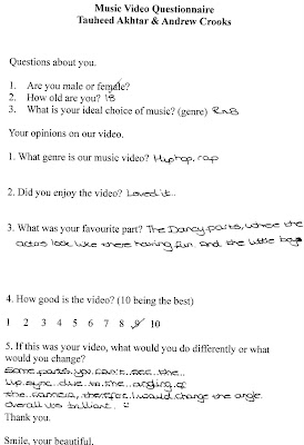
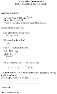

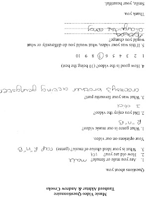
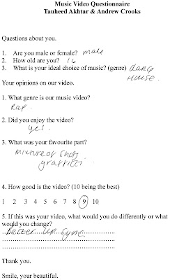
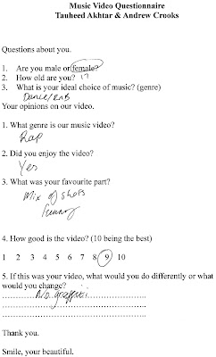
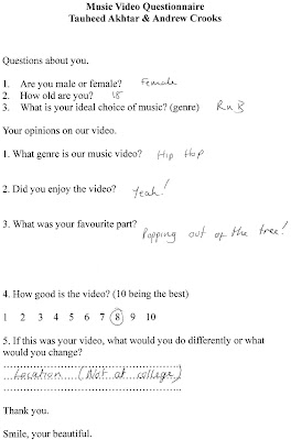
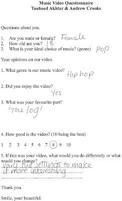

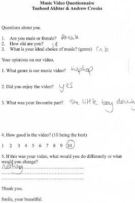 Here are some of the questionnaires we had given out to a sample of students after they watched our video. The sample included a range of males and females aged from 17-19 and were all from Wyke College. We generally had positive feedback for our video. Majority of the sample had given us 8/10 on how good our video was. The main criticisms we had were the 'college' location and that the lip movement could not always be seen due to the editing. The main positive feedback we got was that we had a young model who seemed to be enjoying himself, some of the sample like the shots with the tree during one of the choruses because it was funny and unexpected. Me and Andrew were very pleased with the feedback because most of the sample we used stated that the ideal music for them is Rnb and Hip-Hop, so we feel as if we have reached out to our target audience. The sample also wrote that they thought our video was of a Rap genre song so I also believe that Me and Andrew were successful in making a video which matched the genre of our chosen song.
Thursday, March 31, 2011
Music Video Final Edit/ Finished Product
Monday, March 21, 2011
Advert Second Draft


For the next two drafts me and Andrew made we decided to add another comment, but this one is not by a magazine, this one is by one of the world's most successful rap artists Jay Z. in addition to this comment we decided to change 'Coming Soon' to a date to show exactly when the debut album will be released. The use of different pictures allows all of our products to compliment each other because the pictures are used multiple times for different purposes.
Wednesday, March 16, 2011
Advert First Draft

Here are the first two drafts that Me and Andrew made for our first ancillary text. Is is a magazine advertisement for the release of a debut album by the artist named Teed. We kept our ideas basic and simple yet similar to one another because we could then give feedback to each other about our products. For instance after we both made our first drafts we decided to use other pictures for other drafts and after seeing Andrew's advert I decided to use the fact that he included a comment made by a critic. It makes the advert look more professional.
Friday, March 11, 2011
Chosen Font
 This is the font we chose to use for our ancillary texts because it is big and bold and it should go well with our products. I uploaded it in white colour to show how it looks because we were unsure about having it black or white. It looks better in white so we will use this font in white for our ancillary texts.
 Thursday, March 10, 2011
Font Styles

Tuesday, March 8, 2011
Disc Designs

This is the design we have created to go in front of the disc once our music video is finished. We chose this picture because we have used it already for both of the Ancillary texts so it all links together very well.
The writing on the picture was done in the same fonts that we used for the poster as well as the digipak so, again, it all links together very well.
Sunday, March 6, 2011
Monday, February 28, 2011
Final Advert

These are Mine and Andrew's final advertisements we chose these two because the pictures look similar and we used the same layout and design because it seems more professional if the two adverts are alike. We included the release date as well as an institution (Def Jam Records) for the album itself and for the advert (XXL). Again, we included the quotes from Q magazine and Jay Z to make our advert more appealing to the audience.
Hand Drawn Digipak Draft 1


Here is one of the layouts I drew for the panels of a digipak. After looking at and analysing other digipaks I realised that they are all very simplistic with minimal writing. I kept to this idea so we do not have to do anything that may be very complex. I used the conventions of Digipaks and included pictures, artist name, institution and a bar code. I also notices that there is minimal writing on a Digipak and so I only decided to put lyrics on the back panel, but for the final product I may change this to a track list.
Thursday, February 24, 2011
Another One
 This is the second picture we have chosen to use for our Ancillary texts. We chose this picture because it only shows half of the model's face. Once in editing the background will be cropped out so the audience will only see half of a face. We chose to show only half of the model's face because it connotates the the audience is not only into music, there is a side of him that people don't know.
Sunday, February 20, 2011
The Chosen One

This is the photo we have decided to use as the main picture for our Digi-pak.
We chose this picture because it shows the artist clearly. Although the artist is not looking at the camera the audience can still see who it is. The main reason why the artist is not looking towards the camera is because it shows that he does not care for wealth and fame, he just doesn't want to go back to his old life. He is looking down towards the ivy growing along the fence because he doesn't want anybody to be living bad life and is willing to help them through the struggle he once faced.
Tuesday, February 15, 2011
Photographs for Digipak/Advert

 We took the first picture to show that the 'ghetto' life in which the rappers came up from can be changed, they can become successful if they try. The hood is flipped up to show the anti-socialness which is stereotyped within the teenage generation, but the look on his face shows that he is interested in the rap genre and it could help him lead a better life.
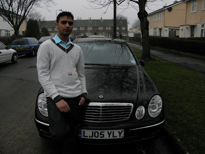
 Again, with the second picture, the car and the logo is highly visible to represent wealth. The model was told to dress very smart to show intelligence and over his jumper he has earphones dangling down halfway. The earphones show that the successful artist has not given up on his music career and is looking to go a long way. His leg is resting on the car to show that he is easy going and not worried about is struggles anymore.
When we took these pictures we wanted the car be involved in some way or another. This is because the car is a Mercedes-Benz and it represents wealth. Being wealthy is what rappers sing about in majority of their songs.
Friday, February 11, 2011
Filming Sessions
Some footage will be posted up soon as my laptop does not accept memory cards because its a boring laptop :(
Also, in regards to filming, we have changed some of our shots so they no longer follow our storyboard but this is because either we did not have the right cast (amounts/members) or we could not gain access to our originally chosen locations. However, this has not affected our video at all because we have made slight adjustments to make up for the little loss that may have occured.
We have also advanced our work on our two ancillary texts by making drafts using the computers.
Wednesday, February 9, 2011
Tuesday, January 4, 2011
Paramore
This video was released after the media had stopped criticising Hayley for being the only reason that Paramore became successful.
Majority of this video was shot in Hayley's house itself, I guess this was a way of her getting back to the negative media comments by showing that she doesn't mind her personal space being shown.
Here is the video
In this video the light bulb is used again, it is inter textual between the two videos. Instead of Hayley keeping hold of the light bulb herself, she has tied down her fellow band members and placed the light bulb on top of them. This is probably to show the media that she doesn't want all of the limelight, and is willing to share it with the band. She is only seen as the main person in Paramore by fans because she is the lead singer, not many people take into account the names of the musicians and are only concerned with the singers.
Throughout this video Hayley Williams seems to show two sides of herself. One being really friendly and inviting and the other being a serious, dangerous and revenge seeking person. This may have been done to show that she is generally a really nice person but if people have negative points of view towards her, she can be evil and turn angry. (But who doesn't do that?)
Saturday, January 1, 2011
Analysis Until We Are Able To Film
So, in the meantime I thought it may be useful to analyse more music videos.
The two videos I am going to analyse are both by the Punk Rock band 'Paramore'.
I have chosen to analyse these music videos because of the lead singer of the band, Hayley Williams.
Hayley has been widely targeted by the media because they say that she is the sole reason for the success of Paramore.
The first video I am going to analyse is for the song called Ignorance.
Here is the video; as you can see, it is set in a small dark room, in which the band is all squashed together with minimal movement space. The main thing to consider about this video the the lighting, as the only light for the most of this video comes from a single light bulb.
Throughout the whole of the video Hayley Williams has control of the light bulb and seems to keep it towards herself for most of the time, occasionally, she moves it towards her band members but it is just for a matter of seconds and people do not really tend to notice it.
Hayley is also placed higher up compared to the rest of the band members to show that she is supreme and leads the band. You can see Hayley as tries to get herself higher and touching the ceiling of the room.


